Quiet Warmth, Minimal Color

Today we explore warm minimalist color palettes, from neutrals to earthy accents, revealing how gentle values, low-chroma hues, and honest textures create calm, focused spaces and interfaces. You will get practical frameworks, relatable stories, and ready-to-use palettes that translate beautifully across interiors, brands, packaging, and digital products.

Principles That Keep Warmth Simple

Warm minimalism thrives on restraint, clarity, and human comfort. By prioritizing proportion, value, and tactile contrast, you can invite cozy energy without visual noise. We will unpack core decisions—base neutrals, accent intensity, and spacing—that make rooms, identities, and interfaces feel intentional, grounded, and quietly alive.

Mood Shaping With Neutrals and Earth

Color shapes emotion before words do. Warm neutrals soften edges, reducing perceived stress and inviting longer, more comfortable attention. Earthy notes—terracotta, ochre, clay—provide grounding familiarity. Together they signal hospitality, craft, and honesty, helping homes, cafés, studios, and digital products feel trustworthy, approachable, and pleasantly human without sacrificing clarity or focus.

Comfort That Lowers Noise

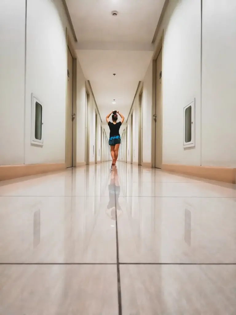
Research in environmental psychology suggests low-saturation, warm hues can lower arousal and reduce visual noise. Think oatmeal walls, greige textiles, and soft wood tones guiding the eye gently. When background anxiety drops, conversations deepen and reading becomes easier. This subtle comfort invites presence, patience, and more meaningful use of space.

Trust and Hospitality in Branding

Brands using warm neutrals with earthy accents often feel handcrafted, honest, and quietly premium. A café identity built around cream, sand, and terracotta communicates fresh bread, friendly service, and patient care. These hues suggest reliability without shouting, helping newcomers feel welcome and regulars feel seen, remembered, and happily understood.

Choose a Center Neutral and Climb in Value

Pick a central neutral that flatters natural light in your environment—perhaps a soft almond or gentle greige. Create lighter and darker siblings by adjusting value, not saturation. This controlled family handles backgrounds, surfaces, and typography, keeping consistency across walls, packaging, and screens while preserving the calm, inviting warmth you want.

Select Accents from Soil, Clay, and Ochre

Pull accent inspiration from places your hands could actually touch: fired clay, raw cedar, weathered brick, desert sand. These references ensure accents feel lived-in rather than synthetic. Keep saturation honest, repeating the accent in tiny hits—buttons, trims, ceramics—so it whispers consistently instead of shouting once and disappearing abruptly.

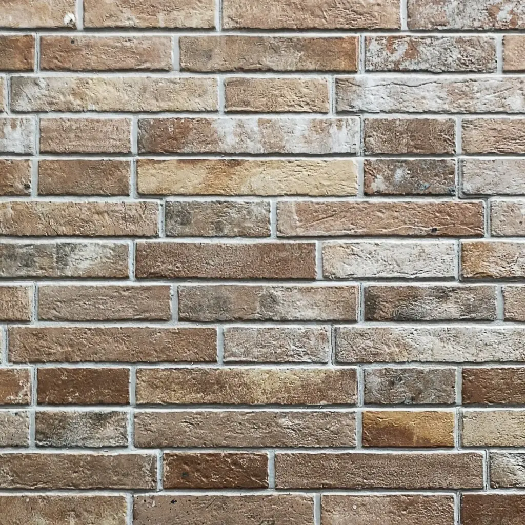
Natural Surfaces that Amplify Warm Neutrals

Try limewash or matte finishes that diffuse highlights, allowing warm neutrals to glow without glare. Combine open-grain oak with unglazed stoneware for tactile balance. These materials reflect light unevenly in a beautiful way, producing gentle gradients that feel hand-touched, intimate, and deeply compatible with restrained yet welcoming color decisions.

Digital Interfaces, Dark Surfaces, and OLED Reality

On screens, warm neutrals can skew muddy if values are too close. Build clear hierarchy with deliberate contrast steps. In dark mode, choose warm grays that avoid stark blue shifts on OLED displays. Micro-interactions benefit from small earthy accents, guiding attention while maintaining a breathable, ergonomic rhythm for consistent reading.

Photography and Styled Scenes that Breathe

For product photos, use kraft paper, untreated wood, and raw textiles as backdrops. Diffuse window light with sheer fabric to avoid harsh specular glare. Repeat a modest terracotta accent through a cup, label, or ribbon. The result looks timeless and grounded, letting objects feel treasured rather than staged or disposable.

Inclusive Contrast and Clear Communication

Warm palettes must welcome every viewer. Guard legibility by measuring contrast and avoiding delicate pairings for body text. Provide alternatives to color-only cues and ensure status states remain recognizable for many kinds of vision. This thoughtful clarity strengthens trust while preserving the soft, human character of warm minimal aesthetics.
Aim for strong text contrast, especially at small sizes. Test against recognized accessibility guidelines, but also print samples and review on low-end devices in bright daylight. Adjust value, not just saturation, to preserve warm character while delivering crisp, confident reading experiences for people with different eyes and viewing conditions.
Never rely solely on hue to communicate states. Pair earthy accents with icons, underlines, or patterns for errors, successes, and notifications. In physical spaces, combine color with texture changes, labels, and lighting cues. Redundancy respects users with color vision differences and ensures your gentle palette remains genuinely understandable in practice.

Stories From Homes, Shops, and Screens

Real experiences show how warm minimal color choices change behavior. Simple shifts—softer walls, better spacing, subtle terracotta accents—can extend dwell time and quiet stress. These accounts highlight repeatable decisions, encouraging you to experiment fearlessly, measure results kindly, and share what you learn with peers who appreciate thoughtful, lasting design.

A Small Apartment Finds Gentle Focus

A reader swapped stark white walls for almond-tinted paint and added clay-colored cushion covers. The change reduced afternoon glare and made evening reading calmer. Visitors lingered longer at dinner, and the resident started hosting weekly soup nights, saying the space finally felt like a steady, warm breath after long days.

A Skincare Shop Grows with Terracotta Notes

A boutique introduced sand-toned packaging and light terracotta shelf labels. Customers described the shelves as soothing and easy to browse. Sales of slower, higher-margin items rose, likely because the environment invited unhurried comparison. The owner kept accents small and repeated, allowing packaging and products to remain the unforced heroes.

Mistakes to Avoid and Friendly Fixes

Even subtle palettes can go sideways: clashing undertones, overpowering accents, or unhelpful lighting. Thankfully, small corrections restore harmony quickly. Learn to diagnose issues by isolating samples, adjusting value first, and letting light guide decisions. These habits keep warm minimal work reliably elegant, practical, and refreshingly easy to maintain over time.

Starter Recipes and Daily Practice

A few reliable combinations help you begin confidently, but consistent practice builds taste. Treat palette work like a small ritual—observe natural references, collect swatches, and revise under changing light. Over time, your eye notices quieter differences, and decisions become compassionate, repeatable, and beautifully aligned with warm minimal intentions.
Motezotamizuti
Privacy Overview

This website uses cookies so that we can provide you with the best user experience possible. Cookie information is stored in your browser and performs functions such as recognising you when you return to our website and helping our team to understand which sections of the website you find most interesting and useful.